I do not recall any other mobile app that has annoyed the heck out of me the way the new My MTN NG app has. I am not sure how MTN went from the very functional app that we all enjoyed to this mess that has us wanting to delete it.
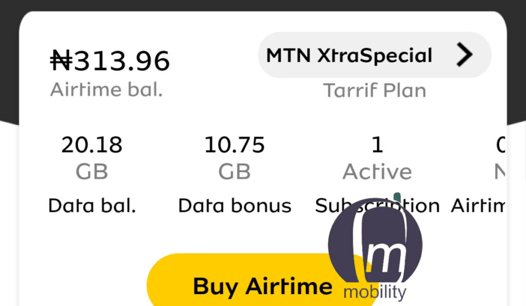
The old MyMTN app is such a simple, usable tool. Launch it and it displays everything you need to see – your airtime balance, your current tarrif plan, your data balance, bonus, etc.

And smack bang where it should be is a “Buy Airtime” button, because if there is anything a mobile subscriber breathes, it is airtime. The app priorities things that are important. The new My MTN NG app, not so.
The new My MTN NG app is dark and makes everything difficult
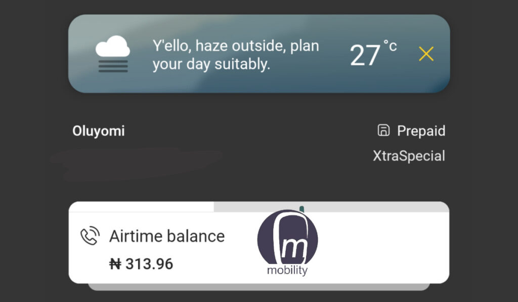
You launch the new My MTN NG app and the first thing you are hit with is the atrocious grayscale colour scheme. Who thought this was representative of the MTN brand? Where is the bright yellow colour scheme that we all love? Who turned off the lights in here?

But it gets worse. The first thing you are presented with is the weather. Yes; because the reason you need a mobile app from your network operator is to tell what the skies outside will be like today. And if you think it can’t get worse, you have another think coming.
Unlike it’s older sibling, the new MyMTN NG app displays your airtime balance, but hides your data balance. It takes you a little trial and error to realize that you can tap on that to reveal your data balance. Or that if you stare at it for a few seconds, it is an animation that changes on its own to reveal your data balance. Sigh.
Congratulations, MTN Nigeria, for inventing one more way to waste our time and frustrate us for using your network. There are other things that annoy and frustrate the user, but there is no point going on and on.
If you haven’t used the new MyMTN app, you really cannot appreciate the level of dissonance that it introduces. MTN went from an app that works so well to this new one that just makes you want to curse and swear.
Was there no sample testing of this app before it was released? I mean, here we are complaining about killer fuel imported by the NNPC, and here is MTN acting like a government agency. If NTA was behind this app, I’d understand. But MTN? Haba. Who jazzed you guys?
No; I am not the only one who thinks the app is whack. A number of other subscribers have expressed the same sentiments to me. I had to help them re-install the old My MTN app, so they could delete this appalling new hack.
This is a classic case of the saying, “If it is not broken, don’t fix it”. It would have been much better for MTN to have duplicated the design of the old app and applied some unique branding here and there to make it uniquely Nigerian.
This new MTN Nigeria app is bollocks, and even that is putting it mildly. It is so bad that even in appearance, it does not look like an MTN product. Can somebody also please get rid of that bloody black and grey background scheme? This is dark humour gone too far.
The designers of the My MTN NG app need to go take a look at 9mobile’s new app and Airtel’s too. They are much better at not frustrating subscribers. They are very easy to use in comparison.
Till further notice, I am sticking with the old My MTN app for all my transactions. It looks the part and works like it should. This new app discards the basic objectives of design in an attempt to be cool and ends up being downright cold.
- Like our Facebook page: @mobilitynigeria
- Follow @MobilityNigeria on Twitter to stay up-to-date when we publish new articles.
- Follow @MobilityNigeria on Instagram for fun stuff.

5 thought on “Review: The new My MTN NG mobile app is a usability nightmare and a branding disaster”